31 January 2012

TEXT as Pattern ーproject endー

It was 20th of January when the TEXT project eded, and it's less than a couple of weeks before, but I feel it's like a month ago. It is because, the final week of the project was so busy, so I'm not sure when I've done what nor when I've finished all, and just feel like it was a long, long time. In another words, my works didn't progress on schedule. This is the biggest problem for me, and I should improve this from the next project. However, I don't totally regret about this, because I spent plenty of time on the research and I proud of it.
All of my patterns looks less decorative than it should be, but I believe it is enough, and I stopped myself trying to add needless things. Usually, I often try adding needless things, because I'm afraid to design simple patterns. There was no evidence of designing simple one, so I felt that I was cutting corner. In this project, however,  I'm not afraid to show my simple pattern collections. There are research, sketches and other drawings that I tried in my sketchbook, and they ensure that my final pieces are not designs which I found in luck, and they are designs which I chose from others.
This style of developing design is completely different from the style that I used to do, and it gave influence on my works. In the last year, I used to use too many colours (maybe all my favorite colours) and just think how to organise them in the pattern, and didn't consider about design and layout enough.
Finally, I'm happy to be able to find a new way of developing design. From now on, I want to expand the range of my design in various ways.


27 January 2012

pay for the sky

I haven't posted more than a week, so there are two big topics. One is about the end of the last project, and another is, needless to say, about the London trip. Obviously, it's too much to look back in a day, so I'm going to procrastinate it and show some beautiful twilight photos instead. Although today was a day off, I had several things to do, so I was outside from morning till night. When it was around 4pm, I was at Govan underground station, and then found the beautiful sky. I like the colour of the sky, but also like streetlights within my photo. When I was little, I used to get into books of a series of 'The Chronicles of Narnia' (A lamppost is an important thing in this story, you know!),  and I still feel magical thing from streetlights, and like them.
Finally I couldn't do that I would do (because of my fault) , but I don't think I wasted the time nor money on the subway ticket. The sky and the street views were well worth £2.40.


18 January 2012

tips

It was a lucky day, today. I didn't work for my TEXT project in the last night, because I needed to read through PDF copies for today's group discussion and hadn't read at all. Although I don't have confidence in my understanding of content of foci, I'm sure my tutor and group mates are nice.
After the meeting of foci, I dropped into artstore before going back to home, and bought some materials I need. When I bought a couple of colour pens (greenish blue and light yellow) I got thin tips with them for free! Those tips enabled me to draw my 'R' design exactly as I imagined.
In the last weekend, I spent much time on making colour samples for my alphabet, and I have wondered whether it was worth or not, but it might be good for me. I made colour samples only for 'R' but now I'm using them for all designs. During this 2 weeks, my ideas changed again and again, and my process hasn't been going straightforward, but I could know that all of it is meaningful and often helps me afterwards.
I plan to finish drawing 2 of 4 patterns before I fall asleep, and put colours on my 'G' tomorrow. Actually I'm still wondering how to put colours on it, but I bet that I'll find good idea in the tomorrow morning, and am going to concentrate on others.


16 January 2012

stripes

Thanks to today's group review,  things to do began to be clear. How to achieve it is still unknown though.
Until today, I have just kept making and haven't had whole image for final review, so my collection of alphabet is messy now. I need to relate my designs each other.
The fine, dense lines in my 'R' design are the most obvious feature in my 4 collections, and I like it, and Chloe also advised me, so I'm trying to develop my designs, based on this idea.
In the afternoon, I left studio after the review and worked with PC in the library. I'm not good at using technology,  but it is much faster when I draw many same patterns or thin lines. I'm quite satisfied with today's work because I finished drawing without any accident, and it's rare.


15 January 2012

the melody of P

Yesterday, I don't know why, but I didn't feel like making something, so spent most of time on developing my idea, and just took some notes. In contrast, today was a day for carrying out them.
After making colour samples for my 'R', I started designing 'P'. Although it is simple, I like 'P' in my photo, so the shape of my own alphabet is not so apart from it. Usually I prefer complicated design to simple one, but I'm trying to make simple design with complex structure, in this project. I hope my attempt goes well.
My idea for the layout of the alphabet came from music. I'm not a good reader, but I felt comfortable to follow musical notes. I guess there are people who feel the same. Firstly I have thought that I would use this idea for 'G', but actually 'P' is more suitable, thanks to ♪-like shape.
Now I plan to draw more, and then layout some good ones from them on a bigger sheet.


13 January 2012

black+white= G ray

It's friday 13th today! but nothing bad has happened, and it's nearly tomorrow now. I'm happy.
Recently I started drawing my alphabet and enjoy it. In the primary research, I luckily found some alphabets with nice shape as well as colours,  so I'm trying to carry them into my pattern. Now I'm exploring between R, W, G, and P, and I concentrated on making pattern of G today. In this morning, I came up with an idea for 'P', and went to the library first, but my mind changed on the way to skypark, so didn't draw 'P' at all. It would be homework.
I'm quite happy with my G, but can't find suitable colour combination for it, and it is the same on my R design. On my R and G designs, I can't imagine how it will look like when I put the certain colour. I guess it is because they are made of many dense lines, and it confuses me. Then what should I do is trying many possible colour combinations and find out good one with my eyes. It's time to go out of the world of black and white! (but actually I started thinking that monochrome pattern is also interesting)
I wish I can find the good pattern for P, and I can put nice colours into G and R designs, by the group review on monday.


12 January 2012

walk along a zigzag way

In the last night, when I was walking around the outside, I found my shadow was bent into zigzag shape on stairs. It showed my original silhouette differently, and was interesting. At that time, I thought pattern on a cloth also appears in many ways, because cloth is not always flat. It will be cut, folded or sewed up.
Until the last night, I was thinking that I would design a huge letter in the middle, because a poster design that I found in a book was impressing and it was so. Although it depends on how to use, my first idea may not suit to textile design. As long as I wish to be a textile person, I need to imagine farther conditions of fabric. Posters should be flat, but fabric won't, so designs for fabric should be flexible.
However, it is really DIFFICULT to reflect the thoughts on works. After struggling whole night, I quickly gave up and decided to imitate, anyway.

W, a letter I chose, has zig-zag shape originally, and this showed another zig-zag after I drew on folded paper. There are innumerable ways to fold, so it is endless, but the end of project is coming!
A clear image still hasn't come into my head, but I think I found some prompts.


11 January 2012

google today's image

In my secondly research, I took 'google today's image' for examples.
They are like for advertisements rather than for patterns, but ideas are clever. I think  I can find any hints from them. Some are quite abstract, but we can recognise 'Google' by finding relationship between each letter. I thought how to organise letters is also important, although main subject is designing good one.

Turning aside, my favorite is a movie on Freddie Mercury 65th Birthday. 


thirdly research?

Before starting drawing, I decided to make sure colours and outlines of alphabet that I found. It is because I'm always lazy in the process of research and often regret having progressed without patience.
Following outline with tracing paper was simple work and didn't take much time, but shows quite interesting shapes. Yet making colour palettes takes much more time and needs effort, I still cannot be satisfied with it.

A main idea for my own alphabet is making stamps, so far, but there are still remaining many things to be considered. I need to leave plenty of time for choosing letters and developing ideas, but it's already wednesday! hurry up!

Although some parts of my 'thirdly research' are not productive and I feel like going all round, I believe it will help me afterwords. 


7 January 2012

paper eyelashes

Today, when I was cutting a piece of paper, I remembered a thing that my friend said that she would use "paper eyelashes" for a special day, in the last summer.
 I didn't have much interest on in at that time, but I felt like to search it today.

They are from a brand in London, and are surprising products. I was surprised, at least.
I often do paper-cutting for my work, but I've never made such detailed, tiny things.
No longer they are eyelashes, but fascinating as a kind of art. Many things are taken as motif, including abstract shapes. This detailed paper-cutting artwork attracts many girls and it gives impact on their faces, visually .

Before then, I have thought that art is separated from common fashion, but it seems that some young girls started including those items into their fashion, nowadays. I think it's good news for designers and students becoming designer.

Besides, I remember a thing that I heard before.
Girls in the 18th century were patching artificial moles on their skin for beauty. They tried to be seen their skin whiter (although there are many other predictions, but all opinion is related to beauty), and found this way. It is funny fact  for us, but after a century, I guess some of our latest fashion will also be funny.


5 January 2012

great works in the past

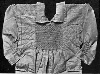
One of my favorite points of textiles is ‘we can use them’.
I want to make something that we can use in our everyday life.

I remember that my tutor in pre-university said that ‘textiles are logical’.
To be honest, I couldn’t understand what she wanted to say, even if it was Japanese. Now, I started to understand bit by bit, but still don’t have confidence.

I think textiles -weaving, knitting, printing and embroidering- are originally had been done at home. People in the past used to do it for themselves, or for their family. The traditional skills that were done by people who aren't known their name made extremely wonderful fabrics.
I think it’s interesting that someone’s mother could make better fabrics than people who have been studying design for many years like me.

I need to study more, practice more, and want to surprise people in the past with my embroidery.


2 January 2012

chocolate talk

I’m a kind of chocoholic, a serious chocoholic.

Today, suddenly I remembered that I saw a movie in the last year.
“Charlie and the Chocolate Factory”, this film is famous for Johnny Depp’s mysterious character.
Firstly, I wasn’t attracted to this film, because of the too mysterious world. I thought that the film was little bit scary.
However, at the 2nd time, gradually I was getting to like this movie’s misterious world. I think if I read the original book before watching this movie, I would imagine a completely different world in the factory and a different Wonka.
I often enjoy comparing the original book to movie, and also compare the world which I imagined and the world which was made to be visible.
The more they are different, the more interesting.


1 January 2012

sports women wearing beautiful dress

When I was watching sports news on the internet in this afternoon, there were pictures of skaters wearing beautiful dress.

I’m not good at sports, so I really admire people who are called athletes, and I think their body and move are beautiful. I don’t know rules in the most kinds of sports, but enjoy watching matches.

Recently, skating is often highlighted by Japanese mass media, thanks to great performances of young skaters. My parents often say that Japanese skaters in the past weren’t beautiful like current skaters. I don’t know much about skaters in their generation, but I know how current skaters are fashionable.
Although it seems unfair, stronger skaters are wearing richer dresses, and of course they are wonderful. Good dresses develop skaters’ strong points instead of interrupting skaters’ performance. I don’t think dresses are counted in judgment, but they are an important part of the sports, nowadays.