3 November 2013

sample making


This week has been the busiest so far, but is not very bad. I think I never get tired by embroidering.
After finishing the first one, I started making the second, third and forth ones at the same time. My second sample was supposed to be a huge one as I was thinking of stitching repeated patterns which are 30 centimetres big each. I didn't think it's unrealisable but it was obviously time consuming work, so I decided to stop working on it, and to concentrate on the other two. Here are my samples.

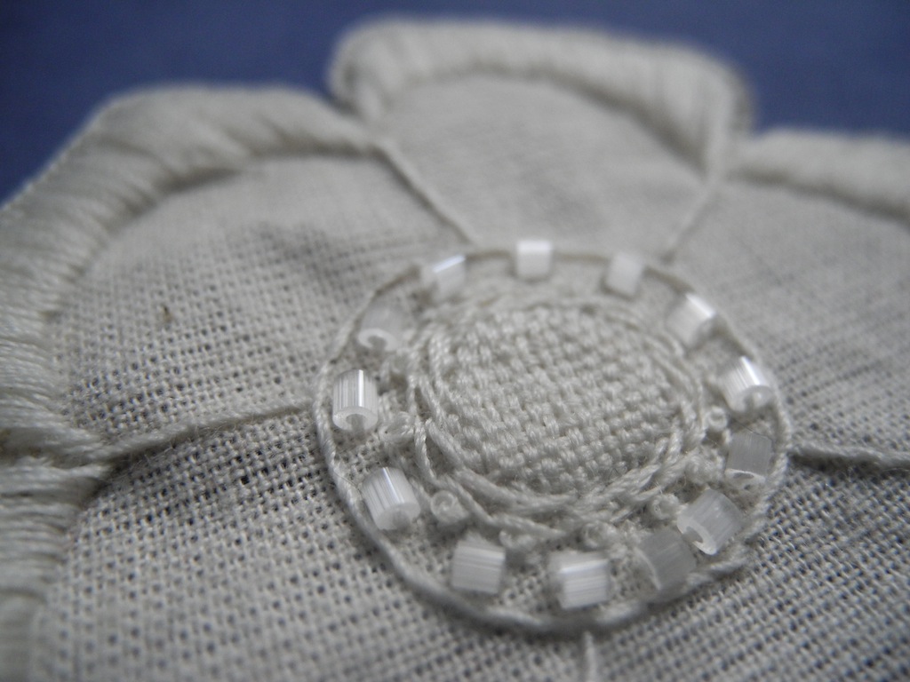
all hand embroidered, almost finished


hand cross stitch and machine fringe stitch


On Tuesday, I had my tutorial with Susan. She told me to use more different type/colour of background fabric, because I had been using black cotton only. This made me to think about material over, and my sample production slowed down again but that was worth it.
In terms of stitches, the technical file from the last year is really helpful, so that I choose the most relevant technique for my designs. 
Hopefully next week is going to be more productive one.

27 October 2013

week6


This week passed very quickly.
I had my mid-term review with Niki on Tuesday. I thought she would ask about my design but she rather wanted to know how to translate it into embroidery, and told me to consider about fabric and stitches. This made me realised that I was trying to skip the important stage and about to start stitching, so I had to calm myself first, then decided to make clear plans.
Wednesday and Thursday morning were spent on fabric shopping and stitch planing. It kept me away from the studio work, but finally I became confident about getting started in sample making.

Stitching as I planed is a quite straightforward way, but still unexpected things keep happening. The first sample making took me so long, and now it's nearly done.

Colour palette—I decided to use black cotton(linen look) and green velvet for main material


Bondaweb on the back of black cotton—I put it to prevent the fabric puckering

An accident happened—bondaweb came out from the edge of cutwork, and made whitish outlines 

Stitched over again—before: left after: right


18 October 2013

design!


In the beginning of this week I've done a few more collaged drawings. 
During this, I thought collaging is probably the best way for me to pull out the image in my mind, that I can paint, cut, tie, glue and cut again, and I quite enjoy this endless process.


On Tuesday I had my tutorial in a small group, and it was really nice to see how everyone else was getting on. The group tutorial actually made me realised that I need to have my mood boards as soon as possible. Without mood boards—and with my insufficient English—, people hardly get the idea of what I'm particularly interested in, so the mood boards must be done before the mid-term review with Niki.
Susan told me to start considering about the actual design, technical aspects and products, and also suggested to look at a couple of designers. It seemed to me too much to do all by next Monday but actually the process is quite straightforward. 

On the same day we had a technical workshop class too. I really liked industrial sewing machines although they scared me because they're so fast and loud. Irish machine allows you to stitch as draw, and with tufter machine you can make interesting texture and colour combinations. 

technical sample of Irish machine

Towards the end of this week, I'm more focusing on design. Firstly I took closed up photos of my drawings in oder to get interesting shapes rather than keep the silhouette of people, then again crop the photos to get smaller pieces which are more developable than bigger ones with stable patterns. 

Even though my photoshop skill is still limited, last year's CAD workshop definitely helped me a lot, that I'm enjoying playing with it. For the design I took colours from my colour book, and I'm quite happy with them, but scales and layouts needs to be explored more over the next week.


crop the red rectangle 

one of my favorite design developed from the piece above


15 October 2013

new feeling

This week I've done few more collaged drawings, and now time to start thinking about actual design. 


just knew that I've been using this set square for 9years :)


13 October 2013

mess


This week became a tough one for me. The more I draw, the more I get confused.
I spent almost whole week on colour research, then started drawing but only with paint. It was quite fun to apply the colour and patterns into my B&W drawings, but they were just too flat and no texture though it takes me ages.

By Tuesday I completely got lost, so the tutorial was really helpful.  First, Susan told me a couple of things to look at—Jazz age art and Matisse's cutwork—which are different to Mexican folk art but relevant to my design. It was actually good to know them, that I felt I got a clue to get back on the track finally. Now I'm going more abstract way rather  than pictorial painting, as I see in those artists' work.
What I learnt from this is to concentrate on drawing is important but to keep gathering information is necessary too. I often try to complete each drawing even if they seem not successful, and this kind of attitude may help to keep quality of drawings high but it definitely slows down the progress. To avoid going round in circles, secondary research and quick drawings shouldn't be ignored.

The second thing is to come out of sketchbook. I was quite embarrassed when she pointed out that I was woking within a small A4 sketchbook, because I should have known how limited a way of working it is. After being out of rectangle sheets, I can draw more freely.

Davis Stuart

Matisse

The main concept so far is unusual combinations of people, flowers and birds, yet most of my drawings look much more colour focused than each object I selected to draw. It means I have to be careful about details and shapes, and explore more next week.


5 October 2013

once a week I feel I'm an art student


Here is a couple of drawings which I selected for this week workshop activity. The top one is 'Outlived I' and the bottom is 'Outlived II' both are done by an American artist Pat Perry in January 2012.

I wondered if they are a right choice, because the drawings are too new and so as the artist who is apparently young, and it's not been long after he's known to the world. For me, it seemed easier to focus on very famous artists from the past, so the sufficient information is on the internet and books, and the artistic styles of him/her are already discussed enough. Despite this, I liked Pat's art and a kind of philosophy belonging to him, and it made me think it is challenging but worth to research on a new artist.

A major part about him is unknown, so this is difficult to tell about 'manifest' of his work. In one of a few interviews, he answered to a question 'What are you trying to achieve with your art?'. He says his aim is to 'encourage people to look at the world in a different more beautiful way' through the art. It means his art is not only telling people the artist's aesthetics and something inside of him but asking people to feel and think by themselves.

I often have a too passive attitude towards art pieces, or oppositely I am too enthusiastic to lean something from them. However, Pat's drawings let me think in a natural way apart from academic aspects, and I think this is why his art attracted me and many other people.


3 October 2013

think over lines and colour


This week I have been exploring between drawing and colour research in order to get a clear view for my own design. 
From the GSA archive I especially liked prints by Carlos Merida, a Guatemalan/Mexican artist, so I attempted to imitate his style by sketching people and redrawing them later on. I am quite happy with the drawings because they are close enough to his style but look different as the people aren't Mexican folks but Glaswegian, and also because they have potential to transform into unique geometric shapes as you can see in the bird's ruler drawing. Shamefully this is the first time to draw people and animals since I got in the art school, so it is exciting but challenging to work with them in comparison with architecture which I became used to work with.

one of Carlos Merida's prints


Not only Carlos's prints but many of Mexican folk art are painted with flat colour blocks with no shades and alternatively complex organic patterns are often applied into each block, and it makes even woodcarvings look two-dimensional. Those simple outlines and small patterns inside are the main elements which I particularly liked, and it could be a basic idea of my own design.

Oaxanan wood carving

At tutorial on Tuesday Susan made me realise that I had been keeping colour research away from drawing, so the many of my drawings are in B&W or in random colour. That's why I am rather concentrating on colour work than drawing like above for a couple of days, and once I get satisfying quality of colour I am going to start applying the colour into drawings. At the same time, I still need more variety of drawings, so that I don't limit the idea of design at this point. 


28 September 2013

a burst of colour, a thirst for creation


In the beginning of this week, we were briefed about a new project. Niki Jones talked to us about her career, her brand and the project very clearly, so that we can set to work with no confuse,  and the talk even made our future clearer.
I liked Folk project, but it's challenging at the same time. My primary idea for this project is Mexican folk crafts. I found out that Mexican culture had been influenced by both Europe and America because of historic and geographic background. The fact enabled me to look at not only Mexico but also broader regions.

Mexican folk embroidery called Otomi


Mexican embroidered blouse

After having gathered enough amount of images, I selected a few images to draw from, then started drawing. Through drawing, I'm trying to understand what makes me interested in Mexican folk art. It means that the drawing is still a part of research, not a part of design. 


Drawings with oil pastels on black paper 


fun of ethnic stitches
—from right: Chinese knot, Turkmen stitch, Indian edging stitch and detached chain stitch


In terms of colour, I have got a collection of photos which I took this week and before. Speciality of Mexican folk art is its bold colour, so I selected photos which show great contrast of darkness and brightness. To get different kinds of texture, I combined every two photos—one organic and one artificial stuff. Next week is going to be busy—further colour research and more drawing.


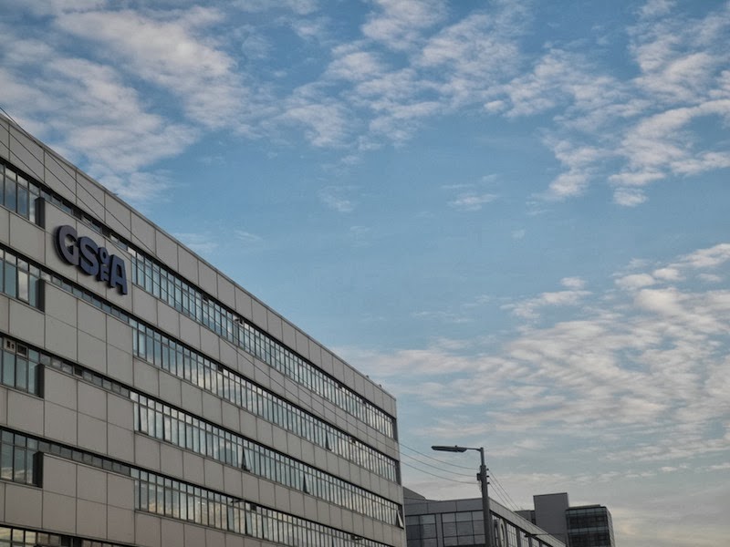
On my way back home,  I saw Skypark windows reflecting the sky, and it made me realised that it's been 2 years since I started studying here. To be honest I'd never liked Skypark, but surprisingly now I'm feeling sorry to leave here after this term. 


21 September 2013

week 1

The first week back in school was relaxing.
On Monday and Wednesday morning, we worked on craft and drawing activities in small groups. It seemed less suitable for our age, but I found that quite a few of materials provided by tutors were unfamiliar to me, so it was fun and inspiring to play with them.

At pechakucha on Friday, I found myself getting used to making presentation compared to the last year. I still have problems in every aspect—especially timing—but at least I could speak more confidently without giving an uncomfortable smile at all time.

stitch samples on paper


In this weekend, I visited GSA graduate degree show at lighthouse. There were many things to learn from master students' work—the work itself and how to present it to the public.
From one of portfolios, I knew an interesting embroidery artist. The artist is called Jazmin Berakha who works in Buenos Aires. She uses a lot of cheerful colours, and I liked the different look of colours which changes depending on background colours.


10 September 2013