The theme of my final project is building sites and construction. I selected this theme because of three reasons. Firstly, I was attracted by boldness and heaviness of materials. Secondly, I liked brightness and strong contrasts of painted colours. And the third is, how the first and the second are opposed to general impressions of embroidery.
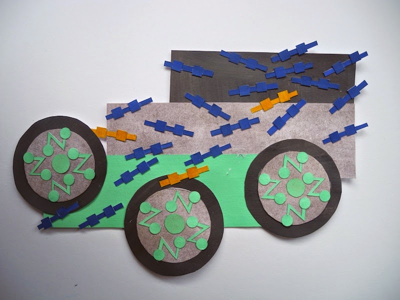
As a starting point, I selected and combined multiple research photos. The result was satisfactory but I needed to translate the photo collages into coloured paper version, in order to analyse colours and shapes. Paper collages helped myself to consider about compositions and colour combinations, but a lot of details and texture have been dismissed in the process of simplification.
To focus on texture and details, I had an idea of getting inspiration from completely different themes. Melted candies and candles have been set as the second theme, however, it did not work together with the original theme and I abandoned this idea at the end.
Although the previous attempt drifted myself from the mainstream, I was able to try out many different materials. Also, this experiment added 3D qualities to my work, and accordingly the second half of term1 was spent mainly on 3D exploration. Firstly, I am interested in clay. The clay objects were good enough in terms of texture, but forms and sharpness were far less satisfactory; therefore I had to find another way of expression. Second challenge was painting on wood board, however, again it was not successful because of mixed dull colours and rectangle templates. Finally I found foam boards as the best material to work with.
Unlike clay, farm boards are still flat without manipulation, and I had an idea to solve this problem—layering. Layering is very simple but effective way of giving 3D quality to drawing, and I liked it. Artists such as Frank Stella is looked as Secondary research. First challenge of farm board 3D objects are still small, less texture and even colours are not as fresh as my 2D paper collage. Therefore I decided to double the size, and made texture and colour samples beforehand. Not all samples are successful but I am still happy with some of details on texture samples, and applied them to bigger layered objects.


