28 February 2013

Print workshop


Technical workshop has started this week. I was afraid of screen printing, because I struggled with it last year. The first few technical samples (pigment printing) were okay because the mixture is quite thick. On the other hand, gummy mixture for procion dye is runnier compared to pigment, so it's difficult to print and I was almost reminded the last year's nightmare.
Although print workshop is hard for me in a way, I do enjoy printing. There are so many interesting equipment and  materials there, and all of them excite me. Especially heat transfer printing is my favorite .. it is able to transfer the texture quite precisely. Because it mirrors, I thought I need to beware of it when I want to design asymmetry shapes.


After the tutorial on Monday, I realised how long I've ignored drawing and concentrated to technical sampling instead. Working on both sides (designing & sampling) is a still big problem for me.
This week was busier than normal, so I faced to my bad time managing skill. Tuesday and Wednesday (when I usually spend on catching up studio work), has needed to be used for essay writing and the fashion show, so my studio work has been standstill. Despite it, fashion show helping was definitely good experience as I could watch dresses very close. Fashion show itself was stunning too—now I'm excited to the next year, and a discipline I want to get in is clear in my mind.


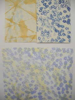
Procion screen painting


flock


Heat transfer

23 February 2013

windmills

   My resent drawings are focused on texture. The word texture sounded unfamiliar for me after I quit oil painting, so I felt awkward when I heard of it at tutorial in GSA. Now I learnt that texture is significant for textile design as well as other art and design, after I had been talked about it by tutors.
   Expressing texture with printed fabric is especially difficult because basically design is printed, it means the material is ink, while other disciplines have far more choices. It means that design for print depends on the original drawings. For example, if you got fluffy design for knit, you can choose wool or mohair yarns witch potentially have fluffy texture. But in terms of print, although you could use fluffy fabric, the impression towards that design would be very different depending on your style of drawing.
   I'm exploring the combination of texture at the moment, and will choose few of them that I'm happy with, so that I can develop the design more.


20 February 2013

imitation

   The beginning of this week wasn't really good as I'd been less motivated because of disappointment towards myself, but I almost recovered after a day and a half of refreshment, and now I'm happy to work on drawing for print. 
   On Monday morning, I only did B&W line drawings and I was quite happy with some of them, but they were still boring without texture and colours. As I suggested at the last tutorial, I'm doing collage in colour at the moment, and the result of it seems better than before. 
  

Left: a photo captured interesting botanical shapes
Right: a photo captured interesting colours


Left: my drawing developed from line drawings and colour research based on photos above
Right: design from a book, Printed Fashion Fabric in 1960s


new friends :)


16 February 2013

namaste India


   I'd like to introduce a book called Contemporary Indian Fashion(library catalogue number: 746.920 954 ROC) which I found in the library. The book's cover is beautiful from a textiles' point of view and this is why I borrowed it.
   Indian textile is famous for their traditional women's shawl called Sari, but their contemporary scenes of fashion and textiles haven't been internationally well known yet. To be honest, I couldn't come up with no indian textiles designers until I read this book.
   India is one of the most developing countries, and the influence can be seen in art as well as economy. In that book, almost 20 fashion designers are introduced, and most of their collections are very interesting in terms of textiles, not only fashion. The work consists of unique sense of colour, skills and influence of western culture, and it is absolutely different to any other kinds of  designers' collection.
   I felt ashamed myself having not tried to look at modern scenes of asian textiles even though I'm from asia and it seems easier to get information than people in the west. The world is much broader than I knew, and so as the fashion and textiles industry. There'll be more and more things I must see.


Right: Fall 2011, Left: Fall 2012


Right: Spring 2013, Left: Fall 2010


Spring/Resort 2011

A treader, the inspiration of the collection above
 photographed by Christian Courreges, French photographer

10 February 2013

knit rotation finished

   And there's only one left—print!
I feel time pasts faster than the last year, and I'm really enjoying it. Needless to say the school work is becoming harder and harder, and getting good mark is difficult as well, but still I'm pretty sure about myself being able to make better stuff than 2 years before. I feel myself changing anyway!


9 February 2013

shake it


My development samples of this week were especially related to fringes.  The key image is the one below, a photo of flower which I found in the botanical gardens. The idea of making fringes had been developed while I was working on technical samples.


These two designs are more successful in comparison with the other development samples, because I could relate my drawing to the contextual awareness. 


Tim Ryan S/S 2010


7 February 2013

ready to cast on

   The main task of this week is drawing more knit-related design and making development samples alternatively. I've been enjoying this process so far, although I found it difficult as well.
   On Monday, I had the last tutorial before hand-in day, and I was made to be aware of quite a lot of things which should be revised. One of two major parts is contextual awareness, and another is about my kitted samples. For contextual awareness, I've got information from varied sources where is too far from the context. Although it is still inspiring, what I need to get is knitted design rather than the others which is linked to my primary idea of design. About my knitted samples, Leigh suggested that I could make smaller samples so that I could try more different patterns instead of spending time on only few.
   Two things above are fundamental issue of my working style, so I really need to improve them one by one, bit by bit. As the first step, today I took my old drawings down, and pinned contextual images on instead, then now I feel my work desk is become more comfortable space to work between drawings, contextual awareness and knitted samples.


There's a couple of my development samples.


4 February 2013

by accident...or by chance?

   I've enjoyed making technical samples over the last week. Especially making lacy patterns was interesting for me, so I did ladder stitch and hole stitch a lot. When I was doing ladder stitch, I somehow did it wrong and made loose stitches by accident. It was definitely accident but I liked it to be honest.     
  After a while, when I started making developed samples I felt like to make the loose stitches again, but it was very difficult to do something in purpose which I did once by accident. Finally I found out how to make them, then decided to apply for design of one of my developed samples.
  The photo below is my developed sample's sample. I'm thinking of making it in other several colours.